A quick explanation of
"Mobile friendly"
those sites that qualify as "mobile friendly".
What does this mean for businesses?
This means that if your web site does not qualify as mobile friendly under this algorythm
then it will be at the back of the queue for all mobile related Google searches.
Why is this?
Google is committed to making sure that the mobile experience is unobtrusive and smooth. Over 50% of all internet searches are now performed on mobile devices. This means that if
you are not coming up through disqualification then you are losing over 50% of potential
enquiries.
How can I check if my site is mobile friendly?
All you have to do to check if your web site is mobile friendly is visit the google website
checking tool here
What is the difference between a mobile
friendly site and a normal desktop type
site?
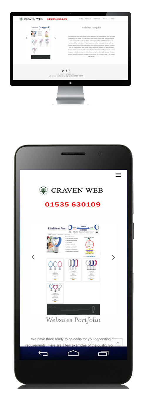
A mobile site is responsive and retina ready.
Responsive; This means a web page can automatically resize to any size of browser. It also resizes in an attractive way with text and images re-organising itself so that the content remains attractive and considerate to smaller screens. Text automatically assumes a nice size and the gaps between content is consistent. The way it works is when a user visits the site a small script of code is used to identify the size of browser being used. This indicates the of device type. The site then loads accordingly.
Retina ready; This is a phrase first coined by Apple when the iPhone 4 arrived. The screen size of the iPhone 4 is 3 and a half inches, and its resolution is 960x 640 pixels. At this resolution, at a normal viewing distance, the human eye finds it hard to make out individual pixels, so this technology was branded as retina display.For example, a MacBook with 15 inch display has a pixel resolution of 220 pixels per inch. Older monitors use a resolution of 72 pixels per inch. Without getting very technical, this basically means that Retina display devices show more pixels in every square inch, this makes images a lot sharper on the eye. A single pixel is the smallest unit used on a screen. So, the bottom line is that for Retina devices, higher resolution images are absolutely required. If 72 PPI images are used for a Retina display they will be much lower quality and wont be as sharp or as vivid as 220 PPI images.
If you need a good design team to either upgrade your existing site or build a new one from scratch then you are in the right place.
Visit our pricing page now to see how competitive we are here at Craven Web
Got a question? email us
Get in touch now and lets get your business online in the best way possible!